What the Jaguar rebrand reveals about balancing innovation, brand identity, and customer trust in modern brand building.
Looking for a Shorter Overview?
AI Summary
Key Moments
Jaguar Takes Bold Visual Rebrand
Jaguar unveiled a completely new visual identity, taking a risk to signal its shift to electric luxury.Shift from Product to Design Discourse
The rebrand diverted attention from the car’s performance to design elements like typography and colour.Balancing Modern Evolution with Core Identity
Successful branding evolution, like Apple and Amul, keeps the essence intact while appearing fresh.Product Must Deliver on the Narrative
Only a genuine product experience can turn a new brand story into believable reality.Have you ever met an old school friend after a long time and barely recognised them?
They’ve changed their hairstyle, dressing sense, maybe even the way they speak. For a moment, you’re unsure whether you’re looking at the same person. After a few minutes of conversation, though, you realise the personality is still there. Sometimes it isn’t. That’s exactly what a rebrand feels like.
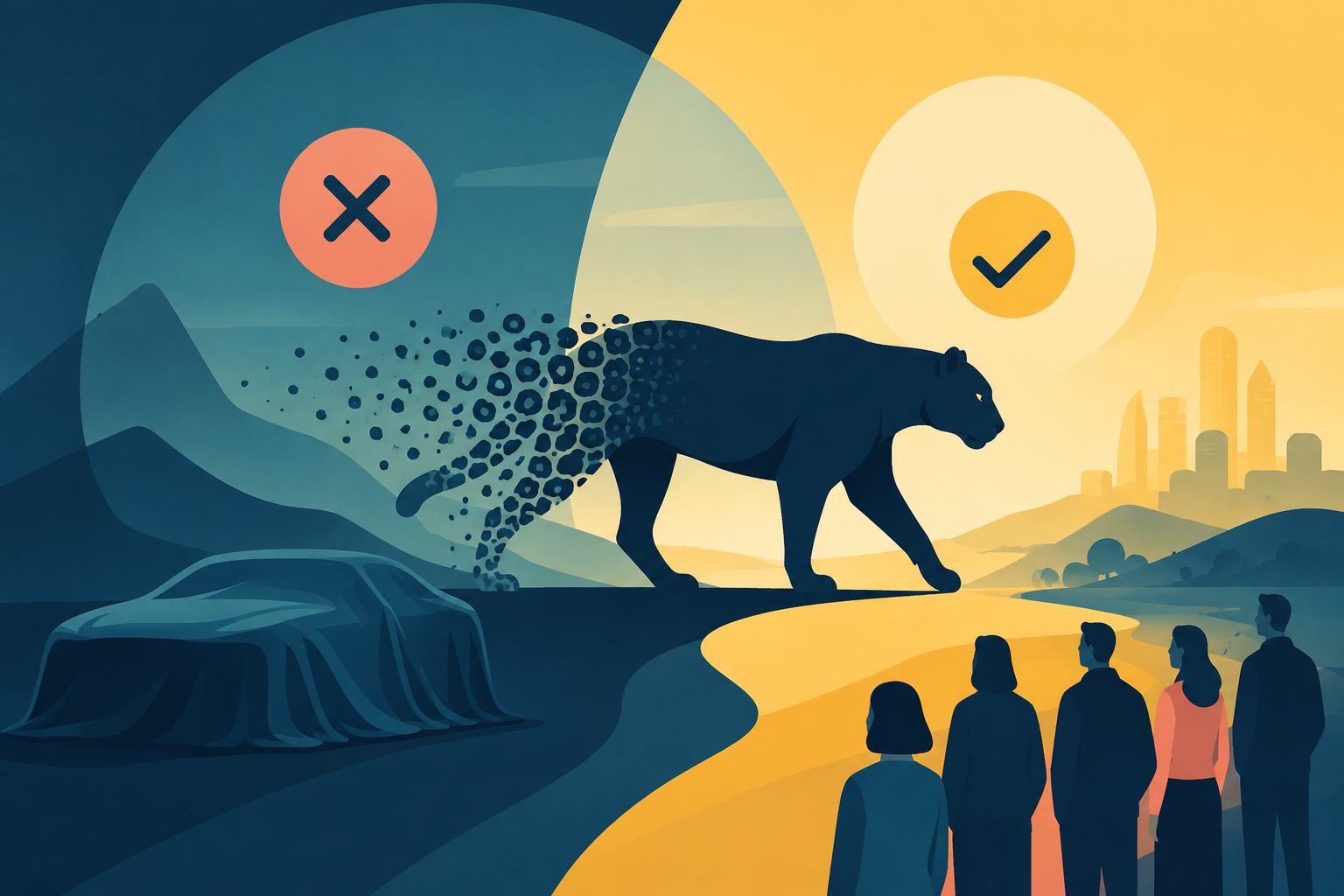
When Jaguar unveiled its new identity, people weren’t just reacting to a new logo. They were reacting to a familiar brand that suddenly looked unfamiliar. Some admired the bold direction, while others wondered whether Jaguar had left too much of its own identity behind.
The Jaguar rebrand became one of those rare moments where the discussion around branding became almost as big as the discussion around the product itself.
What the Jaguar Rebrand Reveals About Building a Brand for the Future
One thing the Jaguar rebrand unquestionably got right was its willingness to take a risk.
In today’s market, many brands choose the safer option. They slightly modernise their logo, refresh a few colours, and hope customers notice the update without feeling uncomfortable. Jaguar did the opposite.
It introduced a completely new visual identity because the company wasn’t just redesigning a logo. It was trying to reposition itself as an all-electric luxury brand for a different generation of buyers.
That takes courage. After all, standing out has never been easy. But standing out and staying recognisable are two very different things.
Imagine your favourite café changing everything overnight. The menu is different, the interiors have been redesigned, the music has changed, and even the coffee is served in a completely new style. You’d probably spend the first few minutes saying, “This doesn’t feel like the same place.”
That doesn’t automatically mean the café has become worse. It simply means people need time to reconnect with something they already knew.
The Jaguar rebrand created a similar reaction. When the launch film was released, many viewers noticed colourful visuals, fashion-inspired styling, and artistic storytelling. What surprised them wasn’t what they saw.
It was what they didn’t. There wasn’t a single Jaguar car. For a company that has spent decades building its reputation around beautiful automobiles, that felt unexpected. Instead of discussing horsepower or design, people spent days debating typography, colours, and whether Jaguar still looked like Jaguar.
That’s where the rebrand became both successful and controversial. Successful because everyone was talking about it. Controversial because many weren’t talking about the product.
There’s an important lesson hidden there.
Attention is valuable. But attention should eventually lead people back to what the brand actually sells.
A good example of balancing change and familiarity is Apple.
Compare the first iPhone with today’s models, and almost everything has changed, from the design to the technology. Yet nobody looks at a modern iPhone and wonders whether it’s still Apple. The company has evolved without losing its identity.
Also read: The Problem With Chasing Consumer Trends Instead of Consumer Behaviour
Amul offers another interesting example.
Its advertisements have adapted to changing times for decades, yet the Amul Girl, the humour, and the instantly recognisable style remain consistent. The campaigns feel fresh, but the brand still feels familiar.
That’s probably the hardest part of modern branding.
Customers don’t expect brands to stay frozen in time. They simply don’t want them to forget who they are.
The Jaguar rebrand reminds us that a rebrand isn’t really about changing fonts, logos, or colours. Those are only the visible parts. The real challenge is convincing people that the new identity still reflects the same values they trusted before.
Perhaps that’s why rebranding is one of the biggest risks a company can take. If you change too little, people don’t notice. If you change too much, people stop recognising you. Finding that balance is incredibly difficult.
Whether the Jaguar rebrand is eventually remembered as a brilliant move or a missed opportunity won’t be decided by social media comments alone. It will depend on whether Jaguar’s upcoming electric cars deliver an experience that matches the bold promise the new identity has made.
Because a logo can start a conversation.
A campaign can create curiosity.
But only the product can make people believe the story.
And maybe that’s the biggest lesson every marketer can take from the Jaguar rebrand. Modern brand building isn’t about becoming someone completely new. It is about evolving without making people forget why they loved the brand in the first place.
– Written by Bhavya Singhal, an Emerging Journalist and a Digital Media and Communication student exploring branding, marketing strategy, and consumer psychology through practical observations and real-world examples.