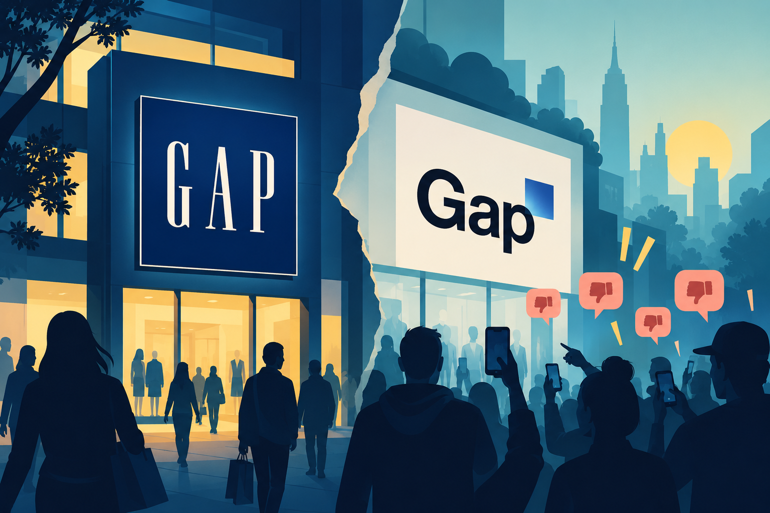
Gap’s logo failure shows how a rushed rebrand can turn a familiar identity into a major branding crisis.
Looking for a Shorter Overview?
AI Summary
Key Moments
Ambiguous Strategic Rationale
Gap launched a dramatically new logo in 2010 without clear business justification, leaving customers confused about the brand’s direction.Rapid Consumer Backlash
Criticism and parody spread across social media within 24 hours, turning the redesign into an internet‑wide controversy.Six‑Day Reversal
Gap returned to its original blue‑box logo after just six days, admitting it mishandled the change and missed community engagement.Emotional Asset Insight
Familiar logos reinforce recognition and trust; successful refreshes must preserve customer‑valued elements and tie to broader strategy.Rebranding is often seen as a way for companies to signal change, stay relevant and attract a new generation of customers. But changing a familiar identity can also carry serious risks. Gap discovered this the hard way in 2010, when a seemingly simple logo redesign triggered an extraordinary backlash and was abandoned within just six days. What began as an attempt to modernise the brand became a classic example of Logo Failure, showing that a logo is far more than a piece of graphic design. It can carry years of recognition, familiarity and emotional connection with customers.
How Gap’s Logo Failure Became a Branding Crisis
Founded in 1969, Gap had become one of America’s most recognisable clothing retailers. Its blue-box logo, introduced in 1990, remained largely unchanged for two decades and became closely associated with the brand. By 2010, however, Gap was dealing with declining sales following the financial crisis, and the company wanted to present itself as more contemporary.
On October 6, Gap quietly introduced a new logo. The familiar blue square was reduced to a small gradient box positioned above the final letters of the wordmark, while the traditional white serif lettering was replaced with black Helvetica. Gap described the change as a more contemporary and modern expression, intended to move the brand beyond its classic image.
The problem was not simply that customers disliked the new design. The bigger issue was that there was little apparent strategic reason for such a dramatic visual departure. The logo arrived almost overnight, without a significant public rollout or explanation of what fundamental change within the business it was meant to represent. As several branding analyses have pointed out, Gap appeared to signal a transformation visually before establishing a corresponding change in positioning, products, or customer experience.
The reaction was immediate. Within 24 hours, criticism was spreading online, while parody designs and discussions appeared across social media and design communities. One website reportedly collected thousands of alternative Gap logo designs, turning the redesign into an internet-wide conversation. What the company intended as a modernisation exercise had effectively become a public relations problem.
This is where the Logo Failure became more significant than a disagreement over aesthetics. Customers had spent years seeing the blue box in stores, advertisements and on clothing. It had become a visual shortcut for the brand itself. Removing it so suddenly meant removing a familiar piece of the relationship customers had built with Gap. A logo can reinforce recognition and trust precisely because people encounter it repeatedly over time.
Gap initially responded to the criticism by suggesting that it was interested in hearing other ideas and encouraging people to submit their own designs. However, the response did little to calm the situation. Just six days after introducing the new identity, Gap announced that it would return to its original blue-box logo. The company acknowledged that it had not approached the change in the right way and admitted that it had missed an opportunity to engage its online community.
Also read: Cadbury: How Emotional Branding Made a Chocolate Brand Bigger Than Its Product
The speed of the reversal became part of the story. Instead of demonstrating confidence in a carefully considered rebrand, the six-day experiment made the company appear unprepared for how strongly consumers would react. The episode also demonstrated the power of social media to amplify dissatisfaction almost instantly.
The lasting lesson from Gap’s Logo Failure is that modernisation should not be confused with unnecessary change. A successful logo refresh should have a clear connection to the company’s broader strategy and should preserve the elements that customers already associate with the brand. Changing a logo cannot, by itself, solve declining sales, outdated positioning or weakening customer relevance.
Gap’s experience also highlights why brands need to understand the emotional value of familiar assets before replacing them. Customers may not participate in a logo’s creation, but over time they can develop strong associations with it. For a legacy brand, that familiarity is an asset rather than something to discard simply because it has been around for a long time.
Ultimately, Gap’s 2010 rebrand failed not because changing a logo is inherently wrong, but because the change moved faster than the strategy behind it. The blue box represented decades of accumulated recognition, while the new design offered customers little reason to let go of it. The six-day lifespan of the replacement became a powerful reminder that when a brand changes its face, it is also changing a piece of the relationship it has built with its audience.