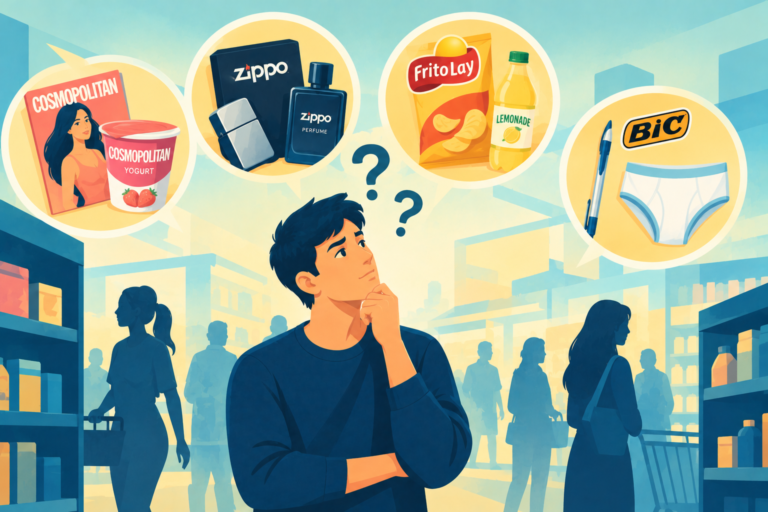
Endless options are dangerous. See how mastering choice overload turns confused shoppers into an unstoppable success.
Looking for a Shorter Overview?
AI Summary
Key Moments
Strategic Categorization
Organizing products into clear sections helps shoppers compare fewer relevant items at once.Visual Choice Cues
Highlighting popular options with stars or bright colors guides customers toward trusted selections.Personalized Product Matching
Online quizzes and filters recommend only suitable products based on specific customer needs.Staged Customization Process
Breaking complex choices into sequential steps prevents decision paralysis.Modern grocery stores often display dozens of cooking oils on a single shelf. Shoppers may spend several minutes comparing the bottles, only to leave without buying anything. This is a common result of Choice Overload, where too many options make the decision feel overwhelming.
Psychologist Sheena Iyengar from Columbia University demonstrated this effect in a 2000 grocery experiment. When she displayed 24 varieties of jam, only 3% of visitors made a purchase. After reducing the selection to six options, the purchase rate rose to 30%.
The problem is not always the amount of inventory. Smart store managers can reduce Choice Overload by organizing and presenting the available options more clearly, helping customers make decisions with greater confidence.
How Brilliant Categories Reduce Choice Overload
Supermarkets sell thousands of food products, but store managers do not place everything on one long shelf. Instead, they organize the products into clear sections. One aisle may be dedicated to breakfast cereals, while another focuses on baking supplies.
This simple structure helps reduce Choice Overload because shoppers only compare a small number of relevant products at a time. Online clothing stores use the same approach by organizing shirts into categories such as summer travel or office wear instead of displaying hundreds of options on one screen. By guiding customers toward products that match their needs, stores make shopping easier and prevent unnecessary confusion.
Local coffee shops sometimes list dozens of hot drinks on their menus, which can overwhelm new customers. To make the decision easier, owners may place a small red star beside three popular options and label them as local favorites. These visual cues reduce Choice Overload by guiding customers toward a few trusted choices. Instead of studying the entire menu, confused shoppers can select a starred drink and place their order quickly.
Software companies use a similar strategy on pricing pages by highlighting the middle plan in a bright color. Customers often choose the highlighted option because it feels recommended and widely trusted.
Cosmetics companies often offer hundreds of face creams, making it difficult for shoppers to know which ingredients suit their needs. To simplify the process, many skincare brands begin with a short online quiz. The website asks customers about their skin type and specific concerns, then filters out unsuitable products and recommends only a few options. This approach reduces Choice Overload and makes the decision easier.
As we discussed in our recent article about Customer Effort, answering a few personal questions can also increase trust because customers feel involved in choosing the right product. As a result, they may feel more confident making a purchase.
Car manufacturers often let customers customize vehicles online, offering dozens of paint colors, seat materials, and engine options. Showing all these choices on one page can create serious Choice Overload and make buyers hesitate before completing their purchase.
To make the process easier, smart car brands break customization into separate steps. One page may focus only on the engine, while the next covers the exterior color. Presenting a small number of choices at a time reduces confusion and helps customers complete the process without feeling overwhelmed. They never have to evaluate every factory option all at once.
Hotel booking websites may list thousands of rooms across a city, but most travelers simply want a clean bed at an affordable price. Presenting dozens of search filters at once can create Choice Overload and make the booking process feel complicated.
Smart travel websites begin with just a few essential filters, such as travel dates, location, and maximum budget. More advanced options remain available behind an additional button for users who need them. By keeping the first step simple, websites reduce confusion and make customers more likely to complete their bookings.
Loved this article? Read more insightful articles on Brand Custodian.
–Written by Rajnish Kumar, a copywriter and strategist with a background in fast-paced journalism, who explores the gap between what brands promise and how consumers actually behave.