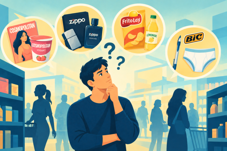
Are you copying competitors? Discover why lacking brand contrast is a dangerous trap that kills explosive brand growth.
Looking for a Shorter Overview?
AI Summary
Key Moments
Visual Distinction Powers Recall
Brand contrast stops viewers from tuning out, making products instantly noticeable and memorable.Copycat Trap Leads to Shelf Ignorance
When every brand looks the same, shoppers rely on memory and skip new, similar options.Liquid Death Proves Radical Contrast
By using skull‑styled cans that look nothing like water, the brand achieved a $700 million valuation quickly.Opposite Strategy Drives Profit
Businesses that act opposite to category norms create clear contrast, become the only brand buyers remember, and sell faster.People who watch television see fifty different car ads in a single week. Every car drives down a clean mountain road. The viewer gets bored and stops looking at the screen altogether. But if a brand shows a dirty vehicle stuck in deep mud, the viewer immediately looks up. This visual difference is called ‘brand contrast’.
When every competitor uses the same design, buyers stop noticing the products altogether. According to marketing research by the Ehrenberg-Bass Institute, visual distinctiveness is one of the most important factors in business growth.
Applying strong brand contrast makes a busy person pause their normal routine. He notices the unusual item immediately and remembers the brand name because it looks nothing like the other options on the market.
Why Brand Contrast Makes Buyers Ignore the Shelf
Many business founders think they have to copy successful companies to survive. If a famous soap company uses a blue box, a new soap maker quickly prints a blue box too. This kind of copying creates a serious problem inside large supermarkets. A buyer sees fifty blue boxes lined up next to each other. Everything looks identical and completely boring.
As we discussed in our recent article on consumer inertia, buyers use brand memory to avoid thinking. The buyer simply grabs the familiar brand and ignores the new ones completely. The new company loses sales because it tries to be like others.
To break this routine, a new company needs strong brand contrast. A smart founder looks at many blue boxes and decides to print one bright yellow box. The yellow colour creates an immediate visual difference. The tired shopper notices the bright yellow box immediately. The sudden colour shift makes him pause and pick up the yellow package just to see why it looks so different from the rest.
Liquid Death, a water company, proved this rule perfectly. For fifty years, every mineral water brand used clear bottles with pictures of green mountains. They all looked calm and quiet, but Liquid Death used complete brand contrast. They put their plain drinking water in tall cans that look exactly like sweet energy drinks and painted skulls on the front.
This sharp brand contrast completely surprised shoppers. Young adults began buying the cans just to carry them in public at music concerts and parties. The company did not change the water inside; they only changed the outside shape and colour.
Financial reports from Bloomberg confirm the company reached a valuation of seven hundred million dollars very quickly. They achieved this massive success simply by refusing to look like a normal water brand. Doing the exact opposite collects money much faster than copying a famous leader. The strange design does the selling work for them.
Some companies try to stand out by adding confusing features, but that is a huge mistake. Effective brand contrast must stay very easy to understand. If a coffee shop sells coffee inside a shoe-looking box, the buyer will feel confused and walk away.
The visual difference must always make logical sense; it cannot be random. A premium chocolate brand creates strong brand contrast by using a dark black wrapper in a market full of bright red wrappers. The buyer understands that the dark wrapper means high quality and a bitter taste. This simple brand contrast makes the chocolate look expensive and genuine. The buyer pays extra rupees without asking any questions.
To make a profit, a business must watch what every competitor does each day. The owner must identify the most common habit in his category. Then he must create clear brand contrast by doing the exact opposite. This direct action makes his item the only one the buyer actually remembers when he thinks of a product.
Loved this article? Read more insightful articles on Brand Custodian.
–Written by Rajnish Kumar, a copywriter and strategist with a background in fast-paced journalism, who explores the gap between what brands promise and how consumers actually behave.