


Looking for a Shorter Overview?
AI Summary
Key Moments
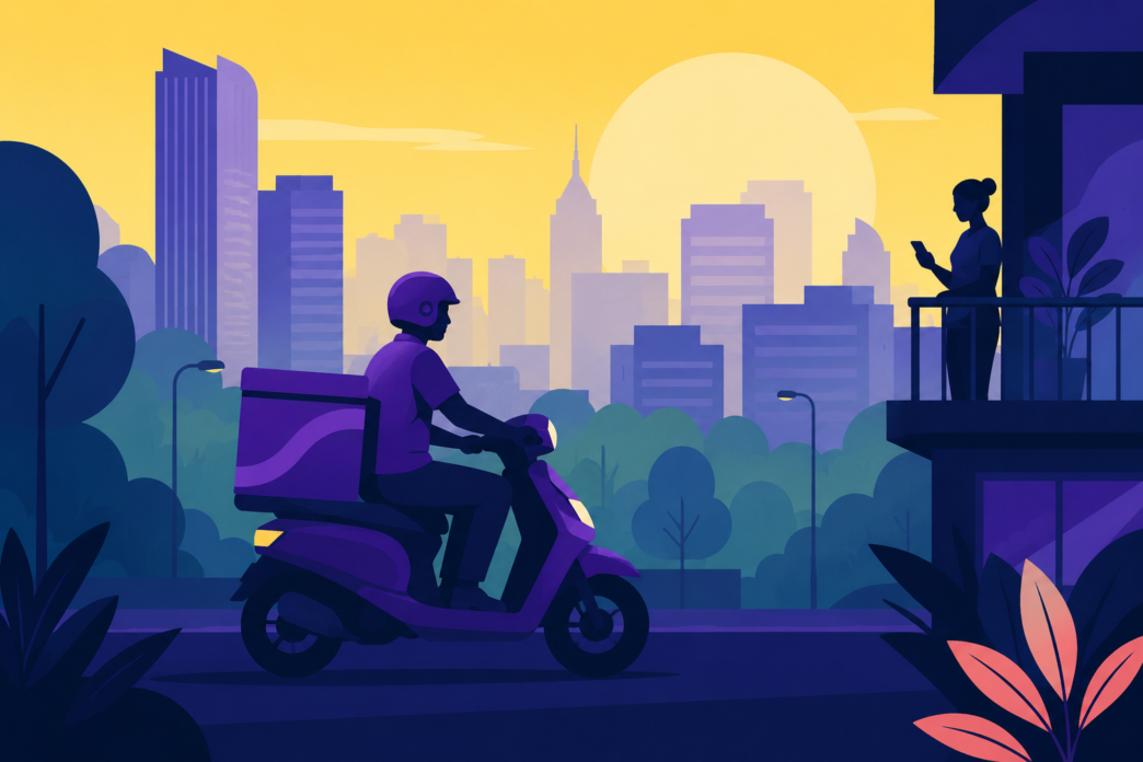
Purple as a silent brand cue
Zepto's bright purple appears on riders and packaging, making the brand instantly recognizable before people see the logo.Consistent visual exposure builds memory
Repeating the colour across every touchpoint reduces the effort needed for recognition and strengthens brand recall.Mental availability drives growth
By becoming easier to think of in buying situations, distinctive assets increase the chances a brand comes to mind, per Byron Sharp's research.Brand consistency beats frequent rebrands
Resisting logo and colour changes preserves years of built‑in memory, while rebrands reset that progress.Walk through any busy street in Mumbai, Bengaluru, or Delhi, and there’s a good chance you’ll spot at least one quick commerce delivery rider.
Some carry yellow bags. Others wear orange jackets. And then there’s the bright purple bag that’s become difficult to miss.
What’s interesting is how often people identify Zepto before they’ve even seen the logo. 
That’s unusual for a company that has existed for only a few years.
Quick commerce isn’t an easy business in which to build a memorable brand. Almost every platform promises the same thing: groceries in minutes, thousands of products and competitive prices. Customers often have more than one app on their phone and switch between them depending on discounts, delivery times or availability. The experience is designed to be frictionless, but it also makes brands look remarkably similar.
Standing out becomes harder than delivering groceries.
Zepto hasn’t said publicly that it set out to own the colour purple. There is no interview where the founders describe it as a deliberate branding strategy. But whether by design or disciplined execution, the company has done something that marketers spend years trying to achieve. It has made a visual cue instantly recognisable.
The colour appears almost everywhere the brand does. On delivery bags. Rider uniforms. The app. Packaging. Outdoor advertising. Social media. Over time, those repeated exposures begin to do something interesting. They reduce the amount of effort required to recognise the brand.
Marketing science has a name for this. Professor Jenni Romaniuk of the Ehrenberg-Bass Institute calls them *distinctive brand assets*. These are the non-verbal cues that help consumers recognise a brand quickly. They can be colours, shapes, characters, sounds or packaging. They don’t persuade someone to buy a product. Their job is much simpler. They help people notice the brand and remember it when they’re making a choice.
That’s an important distinction because branding is often confused with advertising.
Advertising creates attention.
Branding creates memory.
The two work together, but they aren’t the same thing.
This is why some of the world’s strongest brands have invested heavily in assets that go far beyond their logos. Coca-Cola has spent decades reinforcing its shade of red. Tiffany & Co. is almost inseparable from its distinctive blue. Cadbury’s use of purple has become so closely associated with the brand that it has been the subject of trademark disputes in multiple countries.
A single campaign created none of those associations.
They were built through repetition.
The same colour appeared year after year, across every customer touchpoint, until consumers stopped consciously noticing it.
Quick commerce presents a different challenge.
Unlike chocolate or jewellery, groceries don’t naturally inspire brand loyalty. Most people aren’t emotionally attached to the app they use to buy milk or bread. Convenience usually wins. Price matters. Delivery time matters. Product availability matters.
That makes memory even more valuable.
When products are similar, and switching costs are low, small cues begin to carry more weight. Recognition can influence which app someone opens first or which delivery bag catches their attention on a busy road.
It’s one of the reasons marketers have become increasingly interested in Byron Sharp’s work on mental availability. In *How Brands Grow*, Sharp argues that brands grow by becoming easier to think of in buying situations. Distinctive assets help achieve exactly that. They don’t replace product quality or distribution, but they increase the chances that a brand comes to mind when a purchase decision is being made.
Zepto’s purple fits neatly into that framework.
The interesting part is that the colour works even when the app isn’t open.
Every rider on the road becomes a moving advertisement. Every delivery outside an apartment building becomes another moment of exposure. None of those moments ask consumers to buy anything. They simply reinforce a visual association.
Over time, those small moments accumulate.
That’s what makes this worth paying attention to.
Marketing conversations often revolve around campaigns, influencers and media spends because those are easier to measure. Brand assets receive far less attention, partly because they work slowly. Their impact isn’t obvious after a week or even a month. It becomes visible after years of consistency.
Many companies never reach that point because they keep changing course. Logos are redesigned. Packaging is refreshed. Colours shift. Every rebrand resets part of the memory that has already been built.
Zepto, so far, has resisted that temptation.
Whether that remains true as the company grows is another question. Startups evolve quickly, and brand identities often evolve with them. But for now, the company’s visual consistency offers an interesting reminder for marketers.
Consumers rarely remember every campaign a brand runs. They do remember the things they see again and again. Sometimes, that’s a logo. Sometimes, it’s a jingle. And sometimes, it’s just a flash of purple moving through traffic.